CQ State
I played a lead role as a user experience and visual designer in the complete design overhaul of CQ State, a state legislative tracking solution by CQ Roll Call. I created wireframes, mockups and prototypes and established product branding throughout this design process.

The challenges
CQ State, a heavy-duty SaaS product that allows users to track state legislation, had some major user experience issues according to client feedback and user interviews. In addition to technical pitfalls like slow site speed and broken functionality, the outdated site needed some serious redesigning. Additionally, the software looked and behaved nothing like its parent product, CQ — a serious issue considering many clients use both products and often go back and forth between the two. Thus launched a massive project to replatform, rebrand and redesign CQ State.

Focusing on a powerful search experience
We began with a three-day workshop that revolved around understanding CQ State’s features, goals, customer issues, and how it both aligned with and differed from CQ. To get started, the UX team first took a look at CQ’s State most integral feature: its bill search page.
Previously, the bill search in CQ State required users to input criteria and then submit to receive results after a browser refresh — often only to find that the bills weren't what they were looking for and having to start all over again. The goal for the new search experience was to create a fast, easy user interface to quickly find bills with specific criteria that mattered to clients — in the same page and in real time. I designed each filter panel to be user-friendly, intuitive and fast, incorporating modern UI elements, such as toggles, dropdowns and auto-suggestions. The new search also borrows patterns and functionality from similar features across CQ products, creating consistency and recurring patterns for the many clients using both products.

Establishing a clear hierarchy
Next, I set out to redesign the state information pages, creating a clear, readable hierarchy of content relevant to each state while also adding visual depth. Both the interactive graph that displays state bills’ progress over time and a feed of the state's recent actions make the page feel dynamic, fresh and robust. Users now have a compelling reason to frequently return to these sections of the site — pages that had previously felt stale and outdated.

Workflow tools
From there, we tackled the other significant part of the site: its workflow tools. A major portion of the work involved looking at CQ State’s core features: projects, reports and alerts. All of these pages looked and functioned differently from CQ’s versions of the same thing. The UX team set out to compare the two, bringing CQ’s design and elements to the CQ State pages, all the while making improvements on the existing designs.

A significant improvement: I created icons for the reports management page, so that users could now quickly gloss what type of report they created.

Alerts system
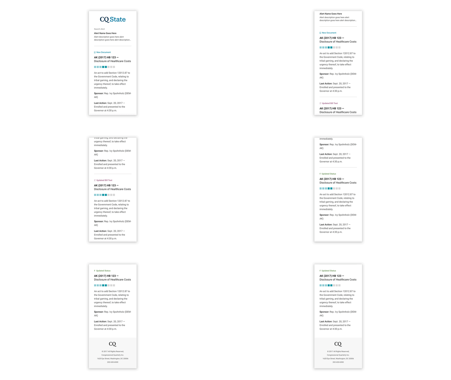
The bill alert system was another major feature of CQ State — it allowed users to receive email notifications every time a specific bill they cared about was updated. But the original alerts system was also a major problem. Its interface was outdated, the language was unclear and the experience was clunky all around. Even worse, the emails weren't mobile friendly and didn't highlight updates very well.

I chose to reformat the alerts setup as a step-by-step wizard, with friendly language and clear UI that told users exactly what they were doing. The process now felt quick and painless. Additionally, I rebranded and redesigned the alerts email template, working with a UX developer to get it out the door. Now, when users received their alerts, the emails are responsive and easily scannable, with icons and language clearly highlighting the specific type of update.

A homepage with purpose
Lastly, I revamped the CQ State homepage, creating a clean yet colorful dashboard that quickly alerts users to updates they should know about and an interactive map that displays state session information. The site also received a branding refresh, with the same color palette, typography, UI elements and logo style as CQ to ensure consistency between the two.

A small but important touch involved adding some visual cues to the homepage dashboard. Specific icons signifying types of bill updates make for a colorful and dynamic experience, quickly alerting users to changes they care about.

Beneath the dashboard, I created a fresh interactive map displaying state session information. The graphic now features branded colors and fonts, with a clean overlay providing information about that state at a glance. Users can explore further if they want with a “more information” link taking users to the state pages.
Keeping accessibility in mind, I also created a list view of the session information, with a date picker to filter by a specific time. Users can toggle back and forth between the map and list view easily on this page.
Overall, the modules add nice visuals to the homepage while also providing quick information that users can dig deeper into if they need.

Testing and feedback
Upon the beta release of CQ State, stakeholders were happy and clients were pretty blown away. Not only was it a vast improvement from the original site; they also felt the system looked and worked far better than the competition. Further testing is about to begin, and from there, we will continue to iterate on the work we've completed so far. In the meantime, we have begun tackling the CQ State mobile site.