CQ
As a user experience designer for CQ, I participated in rapid design sprints to improve CQ’s complicated navigation and redesigned the site’s homepage based on user interviews and usability testing.

CQ, a heavy-duty SaaS product that allows users to track federal legislation, was in desperate need of a redesign. After conducting multiple user interviews and usability tests, we found some major discoverability and navigation issues with the site. Standout projects included the site’s navigation and its homepage.

CQ's Navigation
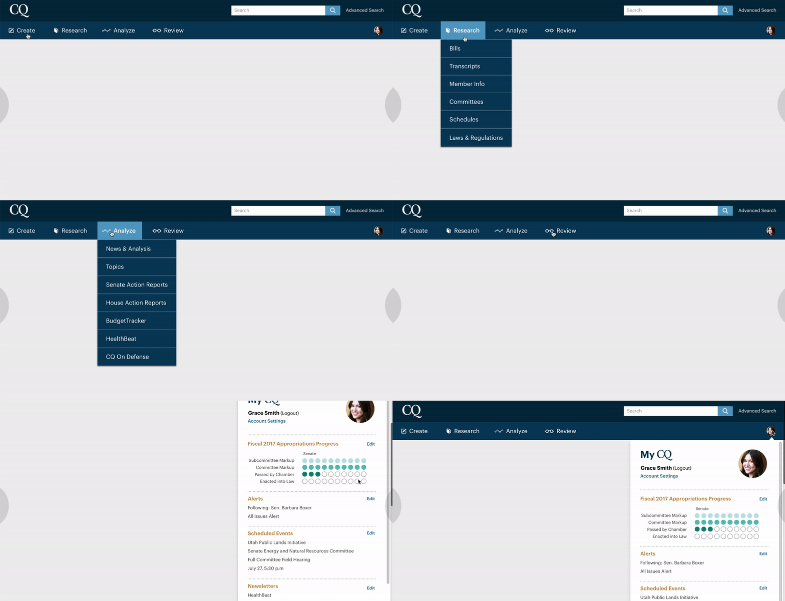
In response to user frustration, the user experience team underwent a three-day rapid design sprint focused on CQ’s navigation. We came up with the concept of using task-based language that easily grouped the site’s features in a way that was centered around users’ workflow: the menu featured options to “create,” “analyze,” “research” and “review” content.

Additionally, we developed the concept of “My CQ,” which allows users to dock specific features they care most about all in one place, allowing for quick, consistent and easy discoverability while also giving a sense of customization.

At the end of the three days, I created a clickable prototype demonstrating the new concept and took it to both internal and external users to get quick initial feedback. After receiving positive reinforcement of the idea, the team soon began production of the new navigation.

CQ's Homepage
With the new navigation in place, it was time to tackle another major pain point of the site: CQ’s homepage. Once again, the homepage suffered from some serious discoverability and hierarchy issues. Users could not distinguish major news of the day from standard news stories, and the most instantaneous updates, located in the the CQ Now section, lived all the way toward the bottom of the site, forcing users to hunt for them or miss them altogether.
Once again, the user experience team participated in a several-day design sprint focused on the homepage design. After considering user frustrations and outlining the homepage priorities, each designer quickly sketched out designs. We were tasked with clearly indicating important content to the user; highlighting the content users are following; and elevating real-time news through CQ Now.

My design, selected as the base for the homepage design, featured a clearer hierarchy of content with a main news well at the top, using varying font sizes and weights. Additionally, I introduced the concept of an “action alert” bar that editors could use to signal breaking news to users. The CQ Now feed now runs alongside the right side for users to constantly see as live updates pour in, with an update button allowing them to refresh the feed and quickly see what’s new. Lastly, the “Content I’m Following” section clearly elevates the content users care about, while giving a sense of personalization on the site.
Later refinements involved adding in filtering for the following feed section to allow for even more tailoring, creating multiple templates for different types of news days, and adding a “Today at a Glance” bar indicating when Congress is in session.
Initial user feedback has been very positive as we continue to iterate on the design.