CQ Knowlegis
As a user experience designer for CQ Roll Call, I took on a lead role in completely redesigning CQ Knowlegis, creating wireframes, mockups and prototypes and establishing product branding. Along with my team, I helped conduct many user interviews over several months both before and during the process that heavily influenced the design.

Scannable profile pages
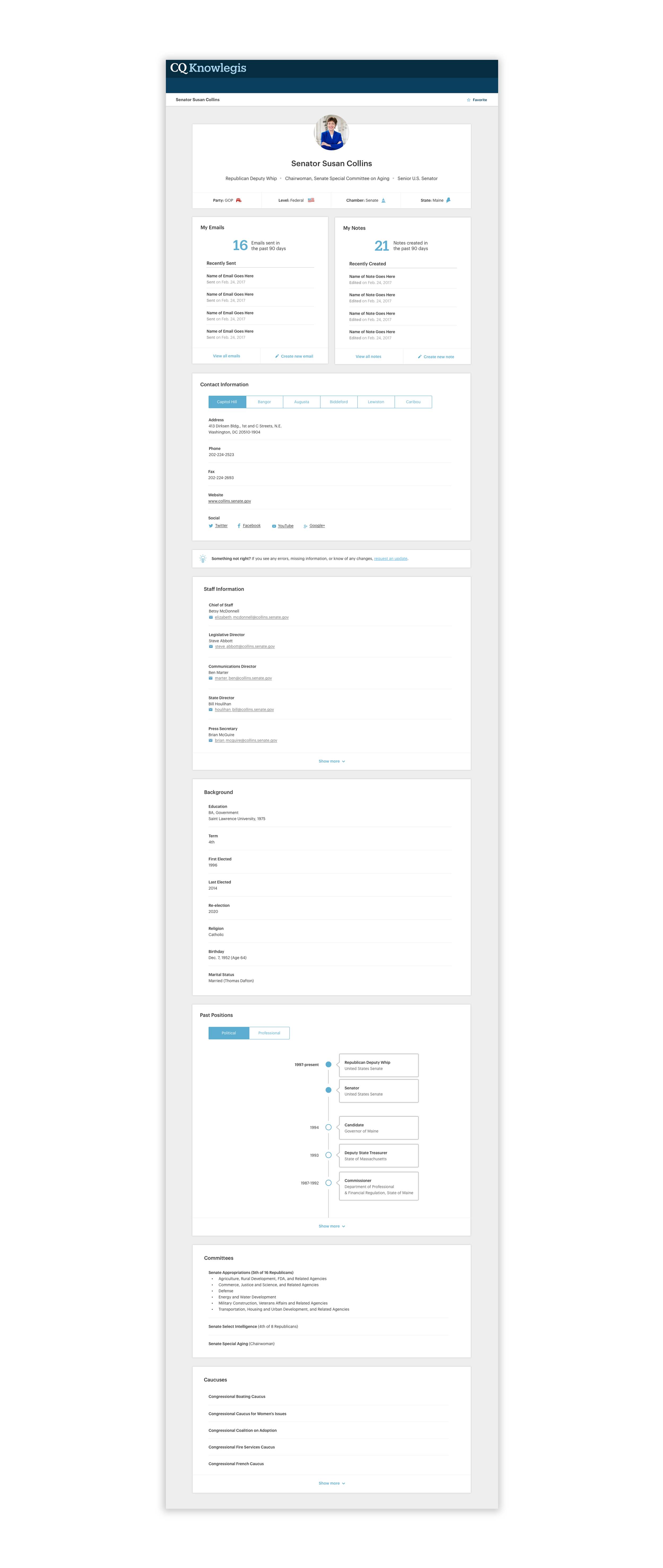
The first item I tackled was the legislator profile page. It was important to create a scannable, easily digestible page that elevated important facts and contact information for that member’s office. The general design features modules that clearly organize information but also allow flexibility of layout as we continue to feature what’s most important to users.

To the top area, I added iconography to create a quick glanceable area of that member’s most important titles and characteristics, including party, level, chamber and state. Closely following this are two modules highlighting users’ emails to and notes about that specific office, becoming an important record of communication. From this page, users can also easily jump into an email or create a note on the spot.
Another improvement to the page was including a visual representation of the member’s past positions in the form of a timeline. It’s a small but fun touch that also brings some more life to the page.

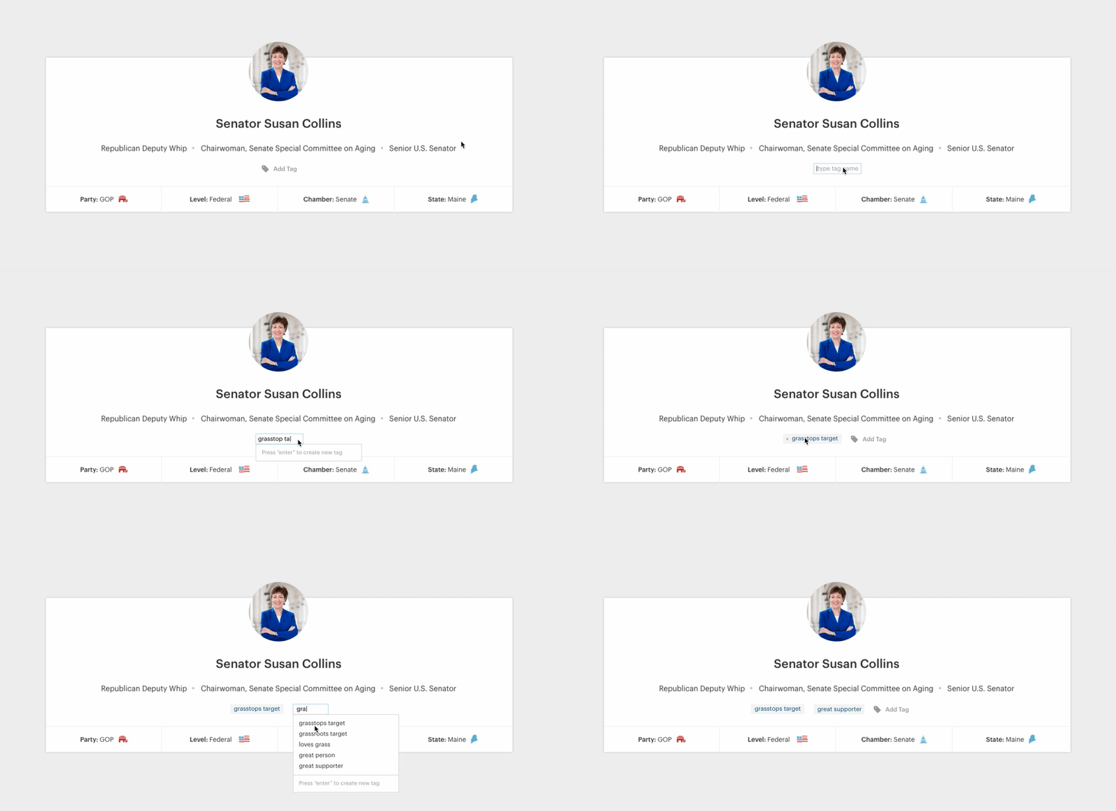
The last major piece of these pages involved the custom tags feature. I designed an interface that allowed users to quickly and easily, create, add and remove their own tags on the profile pages, right on this page.
The profile pages were also designed with the mobile experience in mind, as many users would need to look up information on the go while heading to the Hill. The modular design made it easy to stack the different sections for all the profile pages for easy lookup on their phones.

A fast list-building experience
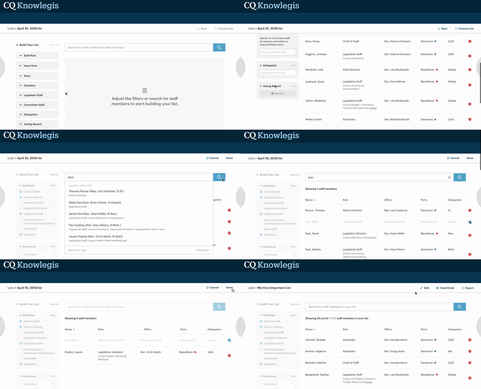
The next most important piece of this site was the list builder. Users needed a way to quickly find specific contacts on the Hill to send emails to. It needed to be fast as users were frequently racing against tight deadlines, often needing to create lists to email in as little as within the hour.
The previous list builder involved a clunky screen-by-screen process that forced users to select only one criterion at a time. The new list builder was designed to be fast, dynamic and all in one location where you can see your list results as you make changes in real time. Another improvement focused on allowing users to add and remove individuals from their list through a search interface and with simple add and remove buttons.
Lastly, users can quickly pull this list into the email tool right from this page.

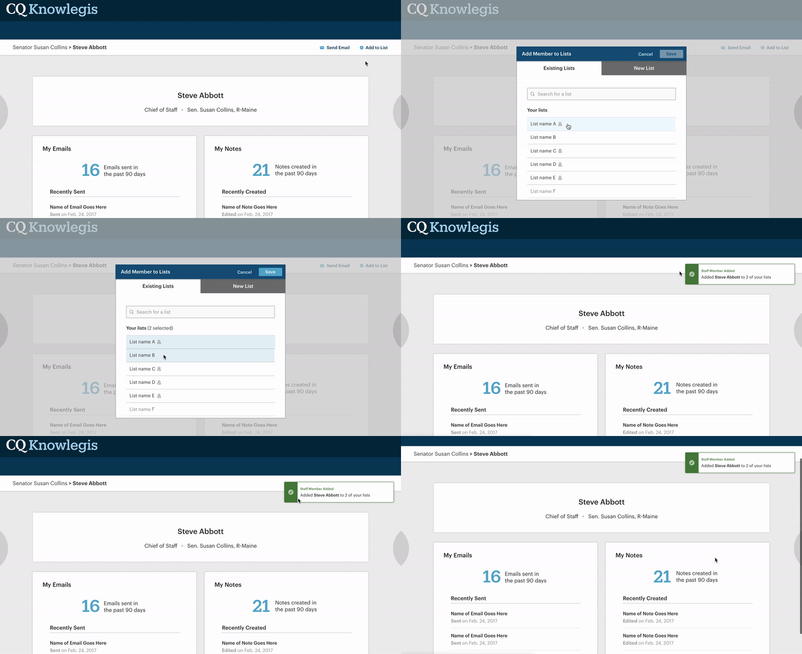
Using the legislator profile page as a guiding template, I also created a similar profile page for the staff member page. An important distinction was the ability for users to easily and quickly add staff members to their lists and even create brand new lists from this page. I created an interaction that allowed for bulk adding without ever having to leave the page, with a system notification indicating success.

More than just a list of lists
Interviews also revealed the need for an easy way to manage lists. People spoke of their inability to find lists, their trouble understanding what types of lists they were creating, and stressed the importance of a seamless way to return to previously created lists. The new management page allows for easy sorting of lists and filtering by recently created and favorited lists.

The updated icons I designed indicate the type of list the user created, while the details panel allows users to quickly gloss information about their lists before fully diving into the full experience.

A simplified email experience
The original email tool was terribly outdated and yet contained a multitude of unnecessary email options. Users frequently created emails in their own email systems because of a complete inability to use the in-product tool. With this in mind, my team produced an email tool that felt simple, approachable and fast, featuring an updated rich text editor with only the necessary options.

As we worked through the designs of this tool and continued user interviews, it became apparent that select users also needed a way to insert their own HTML into these emails. I set out to walk users through three simple options that I called “Standard,” “Plain Text Only” and “Custom” with friendly icons to help illustrate the choices. A “most common” banner also helps guide users to the process that would fall in line with most users’ needs. I also wrote the product copy explaining each option, making sure it was concise and clear.

A more robust notes system
As we interviewed users, we found that many used the notes feature within the system as an important way to keep track of interactions with offices, particularly as staff members moved around and as the company’s internal team itself evolved. The original notes tools came nowhere near to accomplishing this goal and featured nonsensical templates way too specific for user needs.
The notes management page includes powerful filtering that allows users to find the exact notes they are looking for, whether it’s narrowing by features like the owner, text entered in the note, or a date of a meeting. Favoriting and flagging for follow-up, represented here with iconography, allow for users to indicate importance of a note and the need to schedule an additional meeting or phone call.

Testing and feedback
Initial feedback from users on the early designs was very positive. Users were excited to see an overall improved experience. After conducting usability tests on the beta version of the site, designs generally tested positively, with a slightly above-average SUS score of 68.9.
We plan to iterate on the design and make improvements as we continue developing the site.